- Seeing is Selling
- Posts
- Nice camera, shame about the photo
Nice camera, shame about the photo
Why good photography is the secret ingredient for visuals that actually work.
Ed Griffiths
September 19, 2025
Photography: The Secret Ingredient Behind Great Visualisation
Architectural visualisation may feel like a digital magic trick, but here’s the truth: the best visuals are built on the same foundations as great photography. Composition, light, season, weather – all the things a professional photographer obsesses over – matter just as much when creating CGIs and photomontages. In fact, poor photography is often the weak link that undermines otherwise excellent visuals.

I bet you never thought you’d see this Airwolf in a newsletter about photography? Tenuous…but I couldn’t resist!
The Problem
Just because someone owns a camera (or a drone) doesn’t make them David Bailey (or Stringfellow Hawke <now you know how old I am!>). All too often, developers end up with scattergun drone flights, midday shots with harsh shadows, or angles that flatten parking areas into postage stamps. These photos then get handed over for visualisation, leaving the CGI team battling against bad raw material.
And while digital tools let us correct a lot, they can’t change the fundamentals. A dull sky, an awkward horizon, or a badly chosen lens will still show through.
Where Photography and Visualisation Meet
Here are a few key considerations where photography choices directly influence visualisation results:
Seasonality
Want leafy, established surroundings? Photograph in late spring or summer. Need visibility for context or verified views? Winter is your friend. Choosing the wrong season can mean endless Photoshop foliage… and it never looks quite the same as the real thing. (Autumn is on us: only a few more gusts of wind and the leaves will be gone. If you have a pressing need for visuals, consider booking the photography NOW!)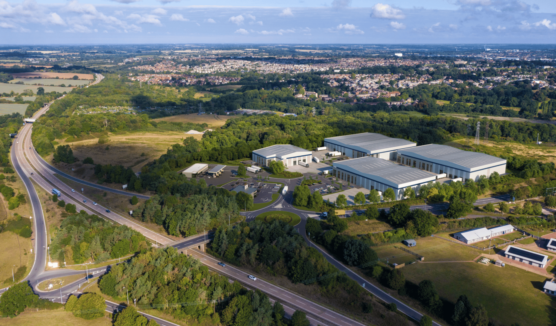
Shooting photography in the right season and with dappled cloud shadow helps show the lush green surroundings to your developments
Altitude & Perspective
Eye level: authentic, planning-friendly, but prone to foreshortening (tiny-looking yards and car parks).
Eaves level: more open, but watch the horizon – it will need filling.
Above the roofline: great for showing rooftop PVs and full building scale.
Drone at 50–120m: ideal for near-context, neighbours, and junctions.
Aircraft (600ft+): dramatic, shows the macro picture and regional positioning.
Each height tells a different story. Pick the wrong one and your planning officer, prospective tenant, or investor may get entirely the wrong impression.
Horizon Awareness
It sounds simple, but many aerials fail because they don’t include the horizon. Strong skylines, landmarks, or just a sense of “place” make a scheme come alive. Without it, the image floats in nowhere-land.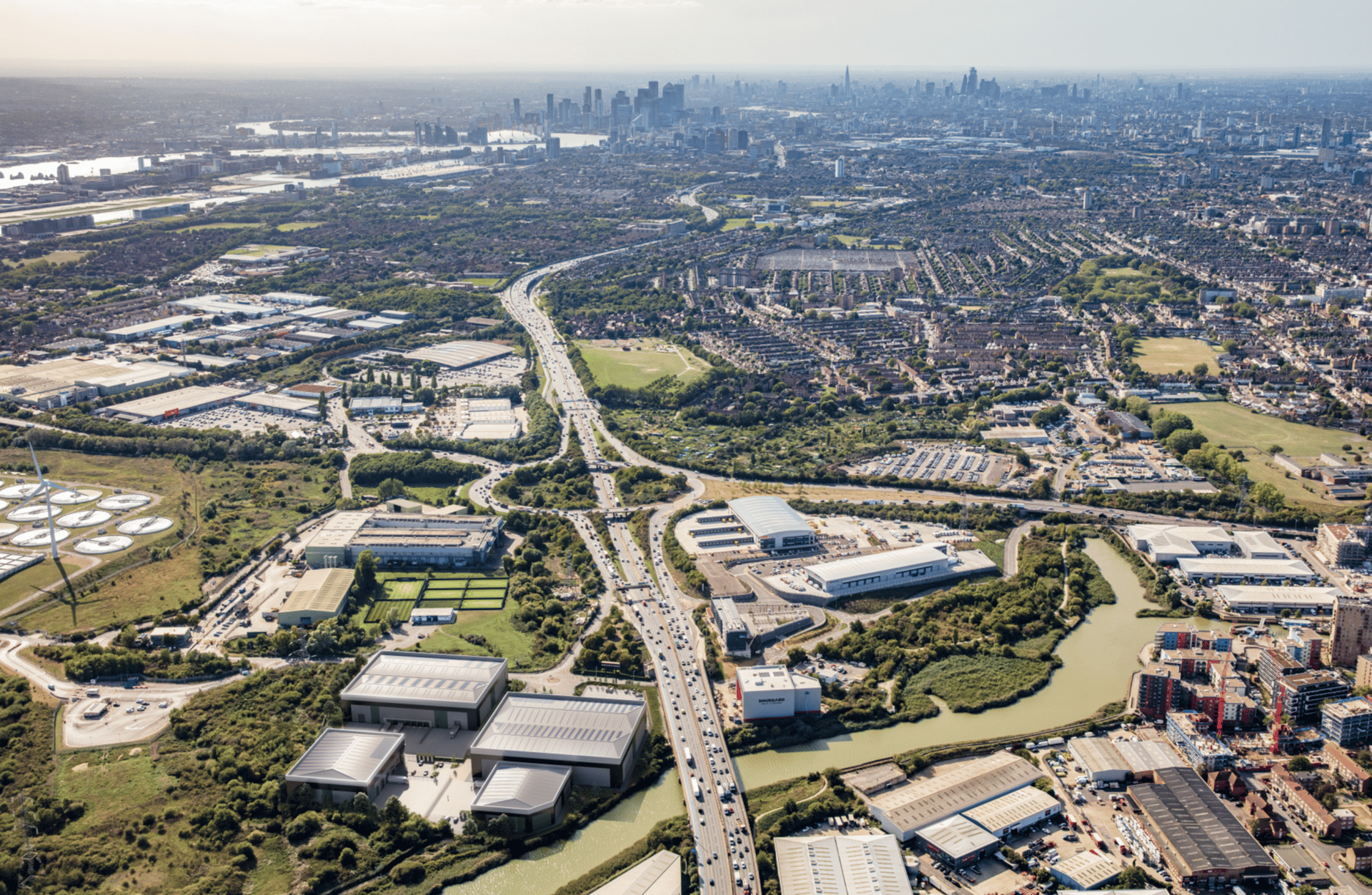
Planned in Google Earth Pro - check out the horizon.
Planning vs Marketing
Planning images benefit from realism – human perspectives that reassure. Marketing imagery, by contrast, often shines when you climb a little higher and show the bigger picture. One size never fits all.Lens Choice
Extreme wide-angle lenses can be tempting, but use them carelessly and buildings warp like funfair mirrors. Keeping verticals vertical is the classic architectural rule, though occasionally bending it helps tall façades feel less imposing. The trick is knowing when the “rules” deserve breaking.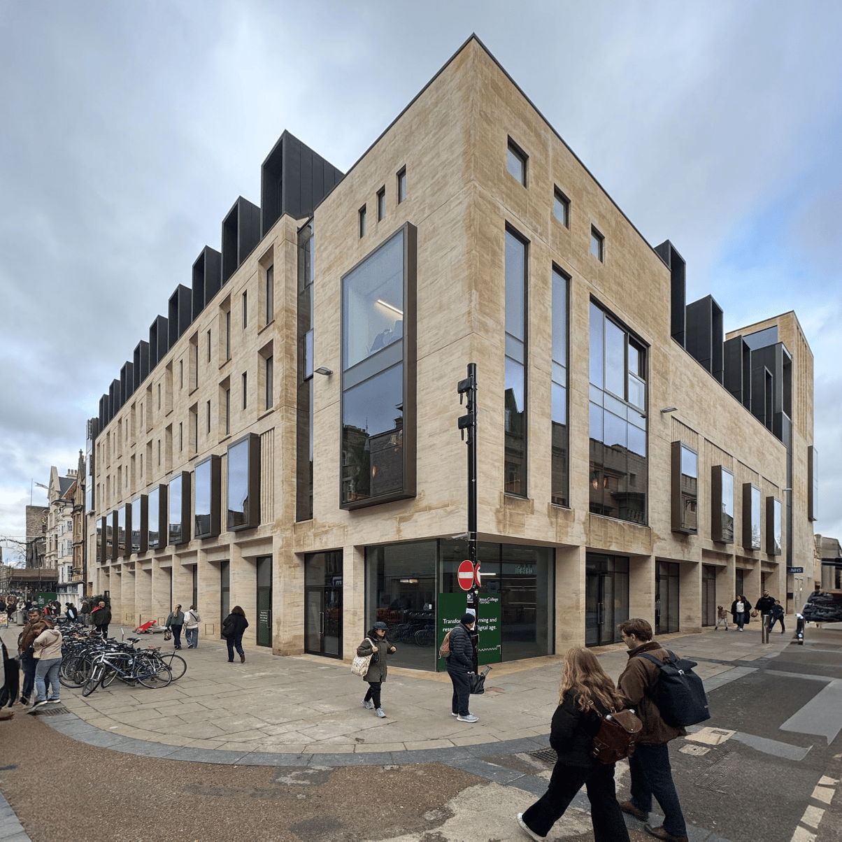
Forced verticals and wide angle leads to looming structures (photo taken intentionally by me to demonstrate the issue)
Lighting & Time of Day
Full sun at noon: harsh, flat, unforgiving.
Overcast or shaded: reflective materials (glass, metal) pick up sky tones and sing.
Golden hour: long shadows, warmth, atmosphere – the difference between “fine” and “wow”.
Sometimes the best shot isn’t in blazing sunshine. A soft, shaded façade with reflections often beats a high-contrast midday image.
Soft lighting to create a warm atmosphere
Dusk imagery allow glimpses into the building that would otherwise be too reflective and mirror-like
Pre-Planning Your Drone Work
Many drone operators fly first, think later. Using Google Earth Pro to map exact camera points saves money and ensures you’re capturing the right perspectives for both CGIs and marketing.
Why It Matters
A bad photo wastes more than time. It sets off a chain reaction: CGIs become harder to integrate > planning officials may be shown unflattering views > and marketing brochures end up flat. Conversely, thoughtful photography makes everything downstream easier: visuals feel natural > integration is seamless > and schemes come across as polished and credible.
A Final Word
At Blink Image we’ve learned – over 27 years of creating visuals – that photography isn’t just a support act. It’s the stage lighting, the framing, the atmosphere that lets a development shine. Get it right and your visuals work harder for you; get it wrong and even the slickest CGI can’t fully recover.
Think of it this way: just as anyone with a guitar isn’t automatically Jimi Hendrix, anyone with a camera or drone isn’t automatically producing the right imagery for your development. Photography sets the tone, and visualisation builds on it. Together, they’re the difference between “here’s a building” and “here’s why this building matters.”
If you’d like to discuss your next project and are interested in options for photography, contact [email protected].